I guess technically the Dodo died off in Africa, but do you know in which country?
Dodo bird seen in Muséum National d’Histoire Naturelle
The Dodo lived, up until humans settled the island, only on the island of Mauritius – named after Dutch Prince Maurice – but Mauritius, 1000 nautical miles east of the African mainland, would not become an independent country until 300 years after the last Dodo sighting.
Getting back to our story, a college classmate donates childrens books to Africa to help create libraries. One book, “Africa, amazing Africa (2021)” by Atinuke, has a page describing each country with a bit of art. I ordered it ‘on hold’ from the library (X 960 A872), and while waiting for it to arrive, gave myself the Africa Challenge quiz.
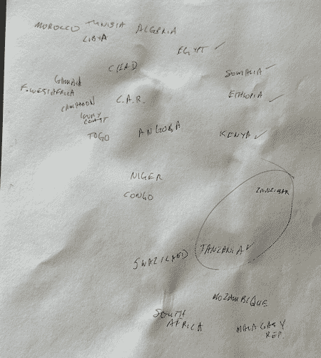
I wrote the names of as many African countries as I could remember on an 8.5 x 11 sheet, roughly in the shape of Africa. I mean, I didn’t do THAT badly, but I missed two large countries, with about a third of Africa’s population between them. And I didn’t get close to half the countries.
I’m not showing you the paper because … wouldn’t that ruin it for you? … I want you to take the challenge yourself!
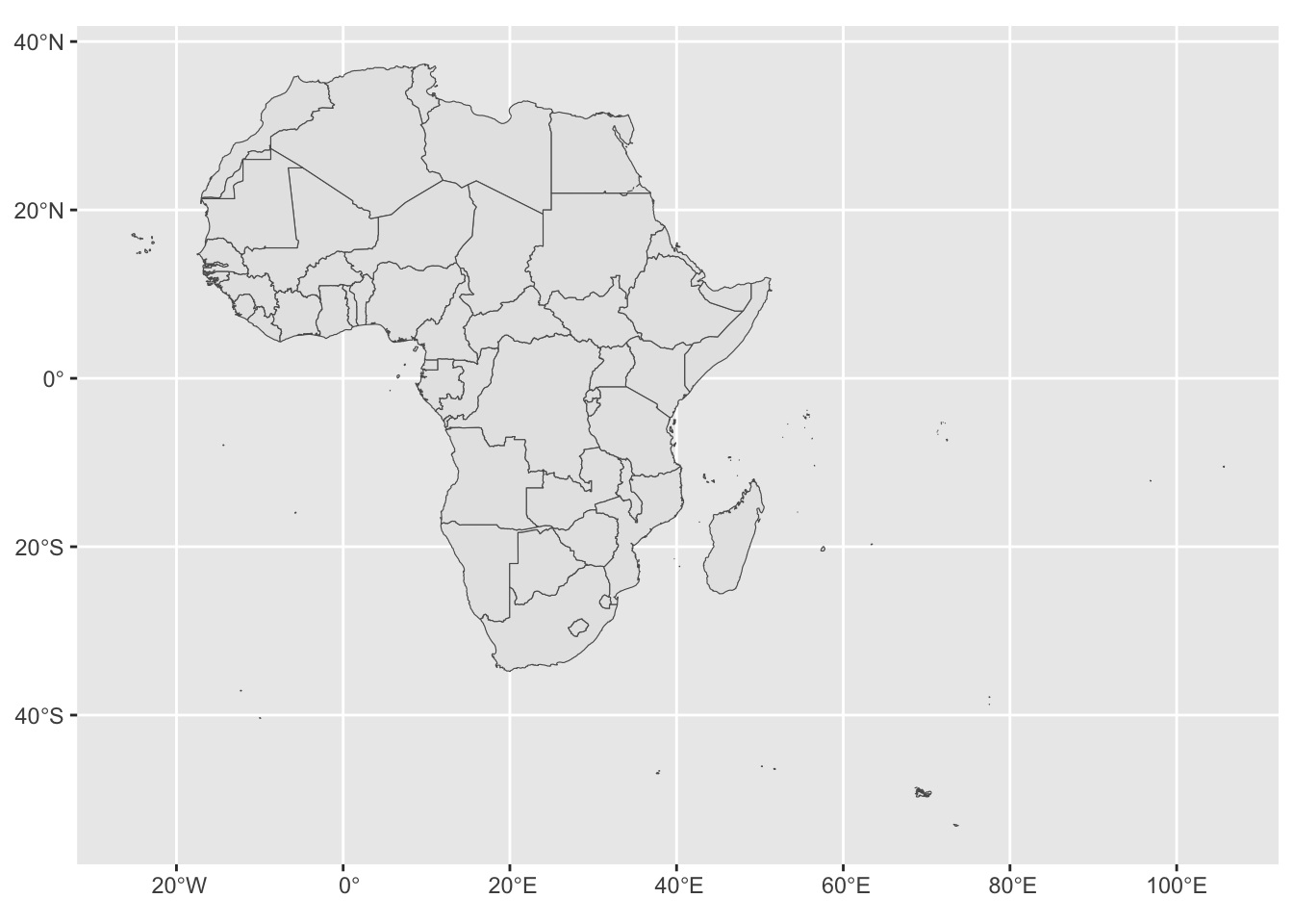
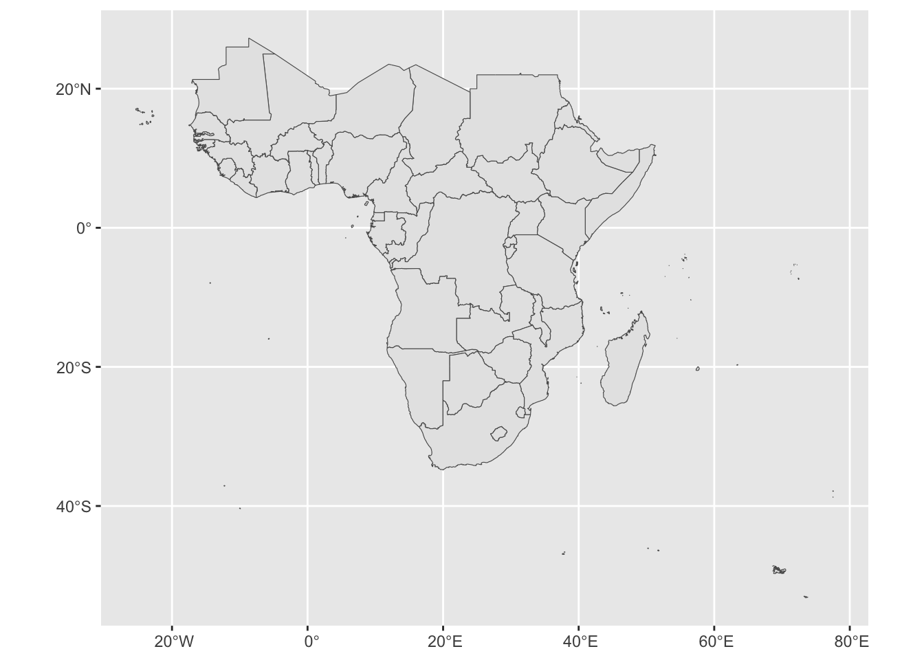
So then, I downloaded country boundaries, to look at countries in Africa. You can go to Natural Earth and get them too. I loaded them into R Studio, and with just a few lines of code in R, I made the maps on this page.
Code
all_countries <-read_sf(dsn="Geobook/Countries", layer="ne_10m_admin_0_countries")# Check out what types of regionalization are in the fileunique(all_countries$REGION_UN)
[1] "East Asia & Pacific"        "Latin America & Caribbean"
[3] "Europe & Central Asia"      "South Asia"
[5] "Middle East & North Africa" "Sub-Saharan Africa"
[7] "North America"              "Antarctica"
Code
Africa <- all_countries |>filter(REGION_UN =="Africa")## So, that's AfricaAfrica |>ggplot() +geom_sf()
Code
## And the dodo ... Dodohome <- Africa |>filter(ADMIN=='Mauritius')paste("Human population of Mauritius:", Dodohome$POP_EST, " (Dodo population: 0.0)")
[1] "Human population of Mauritius: 1265711 (Dodo population: 0.0)"
Code
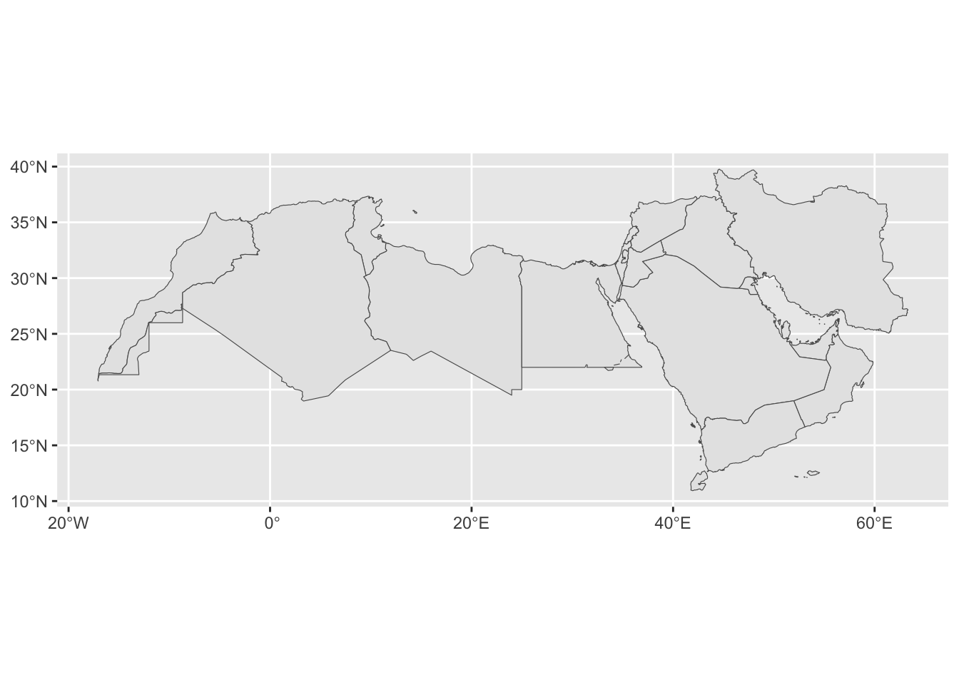
NorthAfricaMidEast <- all_countries |>filter(REGION_WB =='Middle East & North Africa')NorthAfricaMidEast |>ggplot() +geom_sf()
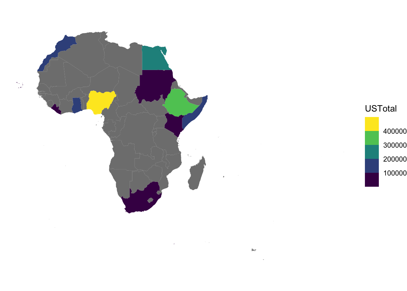
As chance would have it, I had a list of estimates of the people in the United States who say they, or their ancestors, are from particular countries in Africa.
Shaded yellow, you can see the biggest one is Nigeria. Also large: Sudan just south of Egypt.
Now for 2022ACS
In table BO4006, you can download the Census Bureau’s current-year estimates of the same data. So … I did that too!
I made a plotly map from the code, trying to show ancestry estimate when you “fly your mouse” over the country. It works a lot better on your computer screen than on youc phone screen!
Rows: 105 Columns: 4
── Column specification ────────────────────────────────────────────────────────
Delimiter: ","
chr (2): Label, SummaryGroup
dbl (2): Estimate, Margin of Error

ℹ Use `spec()` to retrieve the full column specification for this data.
ℹ Specify the column types or set `show_col_types = FALSE` to quiet this message.
Code
combined_2022 <- combined_data |>left_join(PRA2022, by=c("Ancestry"="Label"))wrappable_plot <- combined_2022 |>ggplot(aes(fill=Estimate, text =str_c("from ", NAME, ": ", Estimate))) +geom_sf(color=NA) +scale_fill_viridis_b() +theme_void()ggplotly(wrappable_plot, # wrap static map in # ggplotly()tooltip ="text"# (The text aesthitic on hover, hover does not work that great))
All in all, I learned a lot about Africa from doing this little project … more from reading about it than this data visualization, though!
---title: "Africa Challenge"author: "George Girton"date: "2023-10-26"categories: [R, SF, Map, Africa]image: "DoDoPICT0251.png"execute: cache: true code-fold: show ---I guess technically the Dodo died off in Africa, but do you know in which country?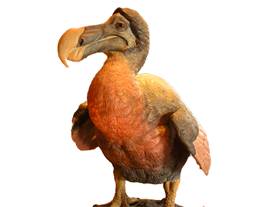The Dodo lived, up until humans settled the island, only on the island of Mauritius -- named after Dutch Prince Maurice -- but Mauritius, 1000 nautical miles east of the African mainland, would not become an independent country until 300 years after the last Dodo sighting.```{=html}In the years since I saw the Dodo pictured above, the Museum have done a much better Dodo reconstitution:<br> <a href=https://www.mnhn.fr/fr/dodo target="_blank">Dodo aujourd'hui au Muséum National d’Histoire Naturelle</a><br>In addition to the much-better feathers, notice the longer legs.<br><BR>```Getting back to our story, a college classmate donates childrens books to Africa to help create libraries. One book, "Africa, amazing Africa (2021)" by Atinuke, has a page describing each country with a bit of art. I ordered it 'on hold' from the library (X 960 A872), and while waiting for it to arrive, gave myself the Africa Challenge quiz.I wrote the names of as many African countries as I could remember on an 8.5 x 11 sheet, roughly in the shape of Africa. I mean, I didn't do THAT badly, but I missed two large countries, with about a third of Africa's population between them. And I didn't get close to half the countries.I'm not showing you the paper because ... wouldn't that ruin it for you? ... I want you to take the challenge yourself!So then, I downloaded country boundaries, to look at countries in Africa. You can go to [Natural Earth](https://www.naturalearthdata.com/downloads/10m-cultural-vectors/10m-admin-0-countries/) and get them too. I loaded them into R Studio, and with just a few lines of code in R, I made the maps on this page.```{=html}<!---# Visit https://www.naturalearthdata.com/downloads/10m-cultural-vectors/10m-admin-0-countries/# Download the file# the file will be ne_10m_admin_0_countries.zip# Unzip the file. It will unzip into the folder ne_10m-admin-0-countries# Look at the file--->``````{r}#| label: geoinit#| echo: false#| options(scipen=999)library(sf,warn.conflicts = F, quietly = T)library(ggplot2, warn.conflicts = F, quietly = T)library(tidyverse, warn.conflicts = F, quietly = T)library(plotly,warn.conflicts = F, quietly = T)``````{r}#| label: geonames#| echo: true#| code-fold: showall_countries <-read_sf(dsn="Geobook/Countries", layer="ne_10m_admin_0_countries")# Check out what types of regionalization are in the fileunique(all_countries$REGION_UN)unique(all_countries$REGION_WB)Africa <- all_countries |>filter(REGION_UN =="Africa")## So, that's AfricaAfrica |>ggplot() +geom_sf()## And the dodo ... Dodohome <- Africa |>filter(ADMIN=='Mauritius')paste("Human population of Mauritius:", Dodohome$POP_EST, " (Dodo population: 0.0)")NorthAfricaMidEast <- all_countries |>filter(REGION_WB =='Middle East & North Africa')NorthAfricaMidEast |>ggplot() +geom_sf()AfricaSub <- all_countries |>filter(REGION_WB =='Sub-Saharan Africa')AfricaSub |>ggplot() +geom_sf()```## Ancestry numbersAs chance would have it, I had a list of estimates of the people in the United States who say they, or their ancestors, are from particular countries in Africa.Now, read the names and numbers.```{r}#| echo: false#| code-fold: trueatab2 <-read_csv("CountryNames.csv",show_col_types =FALSE)## double check the countries unique(atab2$Country)AfricanCountries <-unique(Africa$GEOUNIT)## Match only the countries for which we have a US estimate of people from that countryfromCountry <- atab2 |>filter(Country %in% AfricanCountries)fromAfrica <- atab2 |>filter(Continent=="Africa"&!Country %in% AfricanCountries)## Look at people who say they are from a specific countrysum(fromCountry$USTotal)## As well as those who don't give a country but still 'Africa'sum(fromAfrica$USTotal)#Cape Verde is known as Cabo Verde!# There is a variable for income groups, i wonder what the categories areunique(Africa$INCOME_GRP) # high income group 1 is out of africa```In order to display it on the map, join it with the Geometry table.```{r}#| echo: truecombined_data <-left_join(Africa,fromCountry, by =c("NAME"="Country"))combined_data %>%ggplot(aes(fill = USTotal)) +geom_sf(color =NA) +scale_fill_viridis_b() +theme_void()```Shaded yellow, you can see the biggest one is Nigeria. Also large: Sudan just south of Egypt.### Now for 2022ACSIn table BO4006, you can download the Census Bureau's current-year estimates of the same data. So ... I did that too!I made a plotly map from the code, trying to show ancestry estimate when you "fly your mouse" over the country. It works a lot better on your computer screen than on youc phone screen!```{r}#| echo: trueoptions(scipen=999)PRA2022 <-read_csv("BO4006.csv") combined_2022 <- combined_data |>left_join(PRA2022, by=c("Ancestry"="Label"))wrappable_plot <- combined_2022 |>ggplot(aes(fill=Estimate, text =str_c("from ", NAME, ": ", Estimate))) +geom_sf(color=NA) +scale_fill_viridis_b() +theme_void()ggplotly(wrappable_plot, # wrap static map in # ggplotly()tooltip ="text"# (The text aesthitic on hover, hover does not work that great)) ```All in all, I learned a lot about Africa from doing this little project ... more from reading about it than this data visualization, though!## Outtakes: