Let’s do two COVID-19 plots for Los Angeles county cases over the past 6 months. Let’s assume we have a file of te daily reports from http://publichealth.lacounty.gov right here in this directory!
First, read the data
Code
library(dplyr)library(lubridate) # for working with dateslibrary(ggplot2) # for creating plots of the surge### SET UP Caption and titlecaptionSource='data source: daily reports at http://publichealth.lacounty.gov'titlestring <-paste('LA County new Covid19 cases modeled thru ',today()-1)cases <-read.csv("LACountyNewDailyCases.csv")# Clean the bad input data!#cases$mnum <- plyr::revalue(cases$Month, c("Jan"="01", "jan"="01", "Dec"=12, "dec"=12, "Feb"="02","Mar"="03","Apr"="04","may"="05", "May"="05","Jun"="06"))## Made some typos in the input file. Will it happen again?### (It will happen again!)cases$mnum <- dplyr::recode(cases$Month, "Jan"="01", "jan"="01", "Dec"="12", "dec"="12", "Feb"="02","Mar"="03","Apr"="04","may"="05", "May"="05","Jun"="06")# makin a uniform date from "why did he do that?" ymd columnscases$dstring <-paste0(cases$Year,cases$mnum,cases$Day)cases$date <-ymd(cases$dstring)
So now, add a column showing number of cases per 100 thousand for each date. And, look at the most recent cases
Code
LACountyPop =10007445Divisor100K <- LACountyPop /100000cases$per100K <- cases$Cases / Divisor100K#LA county is ten million, so ... rate per 100K is eyeball-able from the case rate, toohead(cases)
  Year Month Day Cases mnum  dstring       date   per100K
1 2023   Jan  17   510   01 20230117 2023-01-17  5.096206
2 2023   Jan  16   477   01 20230116 2023-01-16  4.766451
3 2023   Jan  15   809   01 20230115 2023-01-15  8.083981
4 2023   Jan  14  1421   01 20230114 2023-01-14 14.199429
5 2023   Jan  13  1534   01 20230113 2023-01-13 15.328588
6 2023   Jan  12  1716   01 20230112 2023-01-12 17.147234
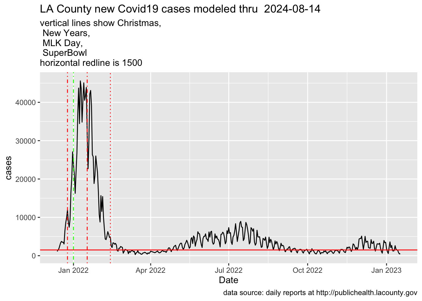
Send the data to a plot showing the increase and decrease of the case rate as the Delta variant hits Los Angeles County in December of 2021
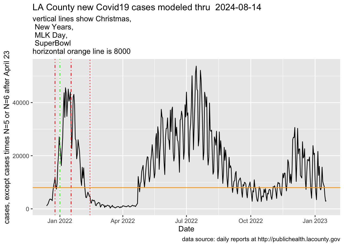
Now, graph that modeled current-surge (but leave the Delta variant curve the same)
Code
## Now, plotting 'proj'cases |>ggplot(aes(x=date,y=proj)) +geom_line() +labs(title=titlestring,subtitle ="vertical lines show Christmas,\n New Years,\n MLK Day,\n SuperBowl\nhorizontal orange line is 8000",x="Date",y="cases, except cases times N=5 or N=6 after April 23",caption=captionSource) +geom_vline(xintercept =as.numeric(as.Date("2021-12-25")), linetype=4, color='red') +geom_vline(xintercept =as.numeric(as.Date("2022-01-01")), linetype=4, color='green') +geom_vline(xintercept =as.numeric(as.Date("2022-01-17")), linetype=10, color='red') +geom_vline(xintercept =as.numeric(as.Date("2022-02-13")), linetype=9, color='red') +geom_hline(yintercept =8000, color='orange')
Model-scaled data after Apr23
Note: you can see what happened here after I wrote about this on June 2 .. I kept following the data, and just moved the updated file over and re-rendered in Quarto.
I feel like this is a time when a lot of people are getting COVID and surviving .. but the hospitalizations – which ARE reported at publichealth.lacounty.gov – are not where they were back in the beginning of the year.
I do like the non-‘modeled’ sequence better, because otherwise you have to guess at a differential rate of reporting which, in the toy example case above, is just invented.
Code
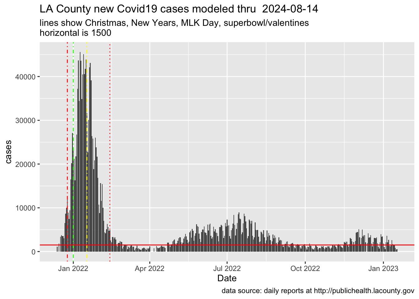
## Now, plotting 'proj'cases |>ggplot(aes(x=date,y=Cases)) +geom_col() +labs(title=titlestring,subtitle ="lines show Christmas, New Years, MLK Day, superbowl/valentines\nhorizontal is 1500",x="Date",y="cases",caption=captionSource) +geom_vline(xintercept =as.numeric(as.Date("2021-12-25")), linetype=4, color='red') +geom_vline(xintercept =as.numeric(as.Date("2022-01-01")), linetype=4, color='green') +geom_vline(xintercept =as.numeric(as.Date("2022-01-17")), linetype=4, color='yellow') +geom_vline(xintercept =as.numeric(as.Date("2022-02-13")), linetype=9, color='red') +geom_hline(yintercept =1500, color='red')
---title: "Delta vs. Omicron ... some numbers"author: "George Girton"date: "2022-06-02"categories: [code, analysis]image: "IMG_0887_sweb.png"---Let's do two COVID-19 plots for [Los Angeles county cases](LACountyNewDailyCases.csv) over the past 6 months. Let's assume we have a file of te daily reports from http://publichealth.lacounty.gov right here in this directory!First, read the data```{r }#| echo: true#| fig-cap: "Calculated multiplier after Apr 23 data"#| warning: false#| library(dplyr)library(lubridate) # for working with dateslibrary(ggplot2) # for creating plots of the surge### SET UP Caption and titlecaptionSource='data source: daily reports at http://publichealth.lacounty.gov'titlestring <- paste('LA County new Covid19 cases modeled thru ',today()-1)cases <- read.csv("LACountyNewDailyCases.csv")# Clean the bad input data!#cases$mnum <- plyr::revalue(cases$Month, c("Jan"="01", "jan"="01", "Dec"=12, "dec"=12, "Feb"="02","Mar"="03","Apr"="04","may"="05", "May"="05","Jun"="06"))## Made some typos in the input file. Will it happen again?### (It will happen again!)cases$mnum <- dplyr::recode(cases$Month, "Jan"="01", "jan"="01", "Dec"="12", "dec"="12", "Feb"="02","Mar"="03","Apr"="04","may"="05", "May"="05","Jun"="06")# makin a uniform date from "why did he do that?" ymd columnscases$dstring <- paste0(cases$Year,cases$mnum,cases$Day)cases$date <- ymd(cases$dstring)```So now, add a column showing number of cases per 100 thousand for each date. And, look at the most recent cases```{r }LACountyPop = 10007445Divisor100K <- LACountyPop / 100000cases$per100K <- cases$Cases / Divisor100K#LA county is ten million, so ... rate per 100K is eyeball-able from the case rate, toohead(cases)```Send the data to a plot showing the increase and decrease of the case rate as the Delta variant hits Los Angeles County in December of 2021```{r }#| echo: true#| fig-cap: "Straight up data"#| warning: falsecases |> ggplot(aes(x=date,y=Cases)) + geom_line() + labs(title=titlestring, subtitle = "vertical lines show Christmas,\n New Years,\n MLK Day,\n SuperBowl\nhorizontal redline is 1500", x="Date", y= "cases", caption=captionSource) + geom_vline(xintercept = as.numeric(as.Date("2021-12-25")), linetype=4, color='red') + geom_vline(xintercept = as.numeric(as.Date("2022-01-01")), linetype=4, color='green') + geom_vline(xintercept = as.numeric(as.Date("2022-01-17")), linetype=10, color='red') + geom_vline(xintercept = as.numeric(as.Date("2022-02-13")), linetype=9, color='red') + geom_hline(yintercept = 1500, color='red')```Now .. add a column named 'proj' (projected), assuming there are 6 actual cases ofr every reported case```{r}#| echo: true#| warning: false#| checkpoint <-date('2022-04-23')aftercheck <-interval(checkpoint,today())# TESTING: cases$date %within% aftercheck# 5 or 6, right?mulfactor <-6## Wrong!# ifelse(cases$date %within% aftercheck,# cases$proj <- mulfactor * cases$Cases,# cases$proj <- cases$Cases# )## Right!cases$proj <-ifelse(cases$date %within% aftercheck, mulfactor * cases$Cases, cases$Cases)## TESTING: cases$proj == cases$Cases## OK```Now, graph that modeled current-surge (but leave the Delta variant curve the same)```{r}#| echo: true#| fig-cap: "Model-scaled data after Apr23"#| warning: false#| ## Now, plotting 'proj'cases |>ggplot(aes(x=date,y=proj)) +geom_line() +labs(title=titlestring,subtitle ="vertical lines show Christmas,\n New Years,\n MLK Day,\n SuperBowl\nhorizontal orange line is 8000",x="Date",y="cases, except cases times N=5 or N=6 after April 23",caption=captionSource) +geom_vline(xintercept =as.numeric(as.Date("2021-12-25")), linetype=4, color='red') +geom_vline(xintercept =as.numeric(as.Date("2022-01-01")), linetype=4, color='green') +geom_vline(xintercept =as.numeric(as.Date("2022-01-17")), linetype=10, color='red') +geom_vline(xintercept =as.numeric(as.Date("2022-02-13")), linetype=9, color='red') +geom_hline(yintercept =8000, color='orange')```Note: you can see what happened here after I wrote about this on June 2 .. I kept following the data, and just moved the updated file over and re-rendered in Quarto.I feel like this is a time when a lot of people are getting COVID and surviving .. but the hospitalizations -- which ARE reported at publichealth.lacounty.gov -- are not where they were back in the beginning of the year.----I do like the non-'modeled' sequence better, because otherwise you have to guess at a differential rate of reporting which, in the toy example case above, is just invented.```{r}#| echo: true#| fig-cap: "bar chart of cases"#| warning: false#| ## Now, plotting 'proj'cases |>ggplot(aes(x=date,y=Cases)) +geom_col() +labs(title=titlestring,subtitle ="lines show Christmas, New Years, MLK Day, superbowl/valentines\nhorizontal is 1500",x="Date",y="cases",caption=captionSource) +geom_vline(xintercept =as.numeric(as.Date("2021-12-25")), linetype=4, color='red') +geom_vline(xintercept =as.numeric(as.Date("2022-01-01")), linetype=4, color='green') +geom_vline(xintercept =as.numeric(as.Date("2022-01-17")), linetype=4, color='yellow') +geom_vline(xintercept =as.numeric(as.Date("2022-02-13")), linetype=9, color='red') +geom_hline(yintercept =1500, color='red')```----